

Consumer debt levels aren’t telling the whole story
The average U.S. consumer remains more resilient than many news headlines imply
5 min read
KEY POINTS
- Consumer debt has increased over time, but that growth must be viewed alongside rising incomes and a larger economy.
- Debt service as a share of income remains below pre-Financial Crisis levels, indicating consumers are generally in a stronger position than many assume.
- While higher prices and energy costs continue to strain some households, aggregate consumer debt metrics point to continued economic resilience.
We have written several pieces on the differing lived experiences within our economy. Those who own home and financial assets have enjoyed net worth gains that have far exceeded the elevated inflation levels since the onset of the pandemic. Meanwhile, those with few financial assets who have counted on wage increases have struggled mightily.
A similar experience may be the case depending on the overall debt level of individual consumers. This week’s charts look at consumer debt from two perspectives: the overall level of debt and debt service relative to personal income. They present an interesting picture, even though one needs to be careful when considering dollar-based measures of many statistics. After all, as our economy grows, we would expect measures of debt and assets to grow along with it, which often means setting “all-time” records for many measures. For instance, recent headlines of U.S. credit card debt exceeding $1 trillion are factually true and resulted in a lot of ink being spilled on the precarious position of the consumer and potential harbinger of slower growth going forward. And yet, although rising debt levels deserve attention, viewing debt and the cost of servicing debt relative to income tells a somewhat different story.
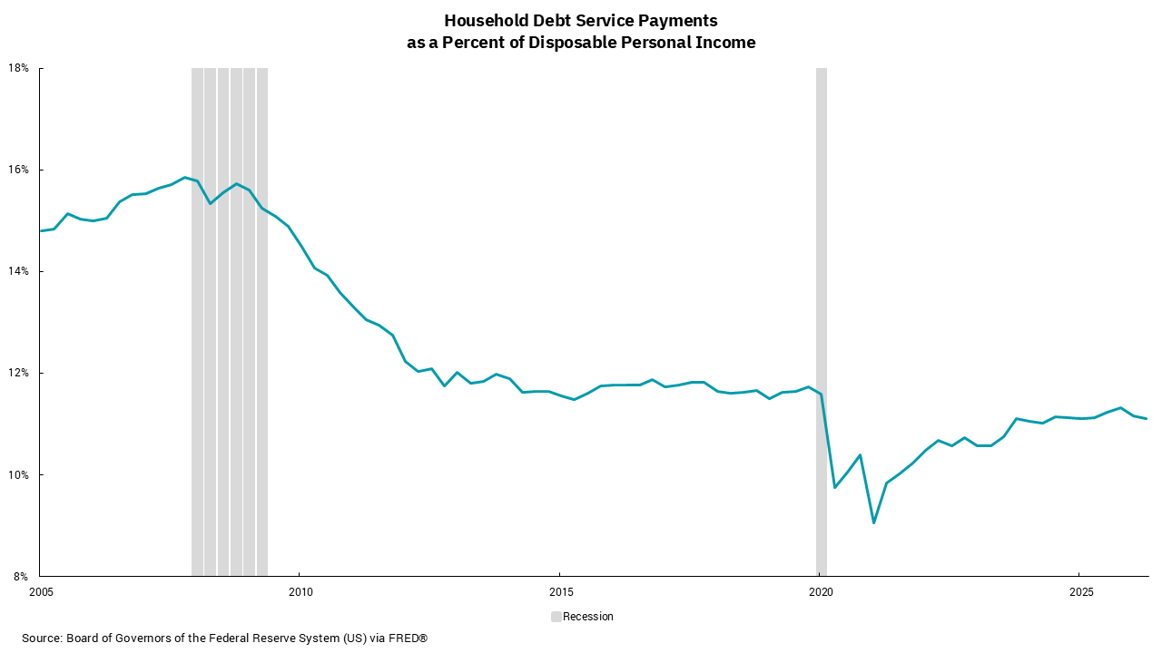
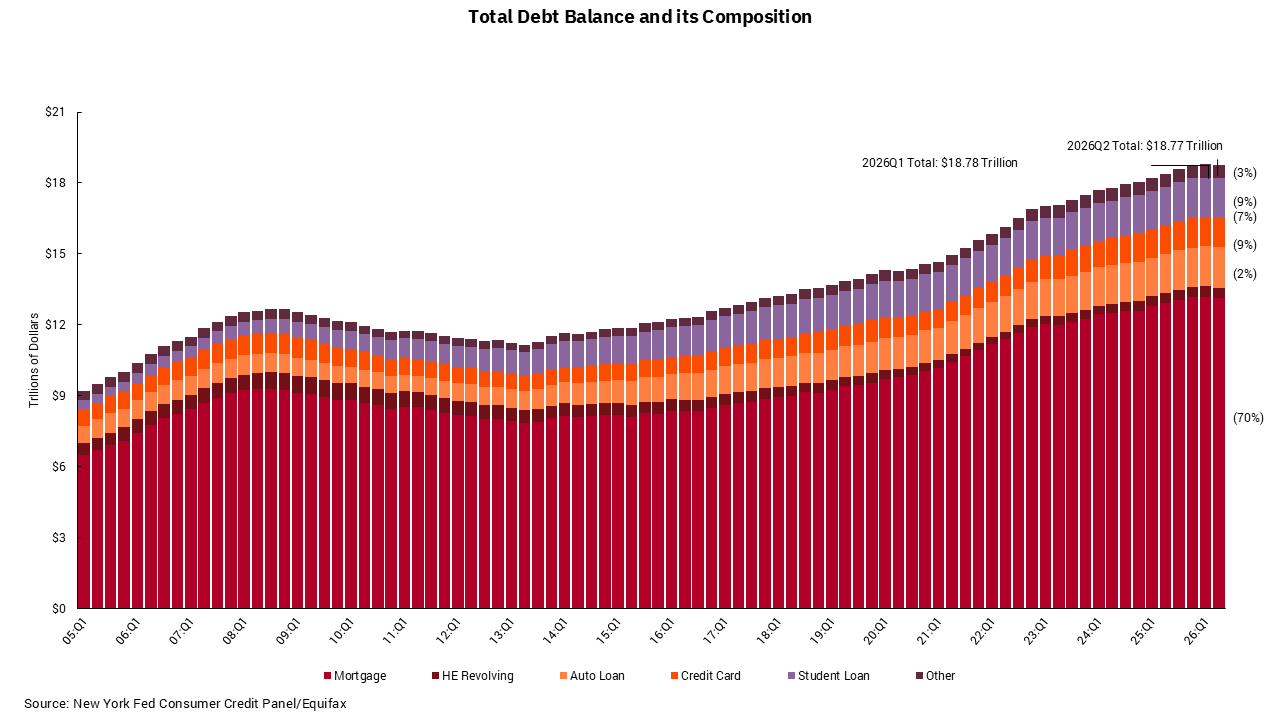
To show the first perspective, the bottom chart shows an increase in consumer debt — home mortgages, home equity loans, auto loans, student loans, credit cards and other debt—over the past 20-plus years. There was a period of slow declines after the Financial Crisis but, as the economy recovered, debt levels resumed their ascent.
The real impact, however, is shown in the debt service-to-income ratio chart. While lower interest rates following the Financial Crisis helped reduce these levels, an equally important factor was slower debt accumulation relative to income growth. The significant drop during and after the onset of the pandemic reflects a material shift in the savings rate as consumers reacted to uncertainty by holding more savings while direct government support payments increased incomes. Debt growth slowed temporarily before improving confidence and low borrowing costs fueled additional mortgage borrowing as home prices moved higher.
Perhaps the most notable takeaway is that, from a debt perspective, the aggregate U.S. consumer appears better positioned today than before the Financial Crisis and even before the pandemic. We could see some shift in the debt service-to-income ratio chart as the Federal Reserve resumes its policy of raising interest rates. However, as long as the job market stays firm, a trend we expect, in aggregate the consumer is not overly stretched from a debt standpoint.
This may mean the economy is in a better position than some headlines would lead one to believe. That does not diminish the challenges many households continue to face from higher prices and elevated energy costs. However, viewed through the lens of consumer debt and debt service, the overall picture appears less concerning than during several previous periods.
Get By the Numbers delivered to your inbox.
Subscribe (Opens in a new tab)